
Processing a Single Shot Milky Way Photo
New! My eBook, The Complete Guide to Milky Way Photography, is now available! This 300+ page book covers post-processing in depth, along with many other topics related to Milky Way photography. The article below walks through the basics, but the book is much more in-depth and more up-to-date. It’s a wonderful resource for learning to shoot the Milky Way. Take a look!
For this article, I'm going to walk you through my post-processing workflow for a Milky Way photo done as a single shot, with no stacking, tracking, or blending (I'll cover those later). This is the most common type of Milky Way photo because it's really easy and accessible - just point, shoot, and process. Even for those that are familiar with some of the more advanced techniques, single-shot photos can still be really useful in some situations. It's also a great foundational place to start before learning the more advanced techniques.
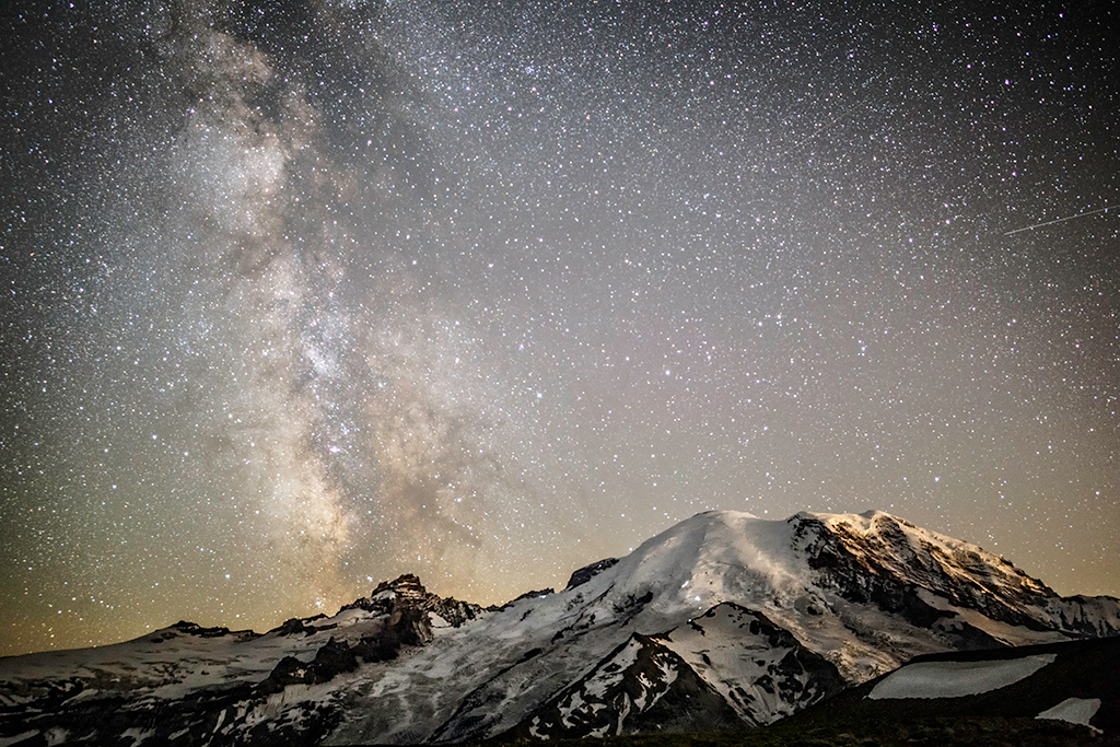
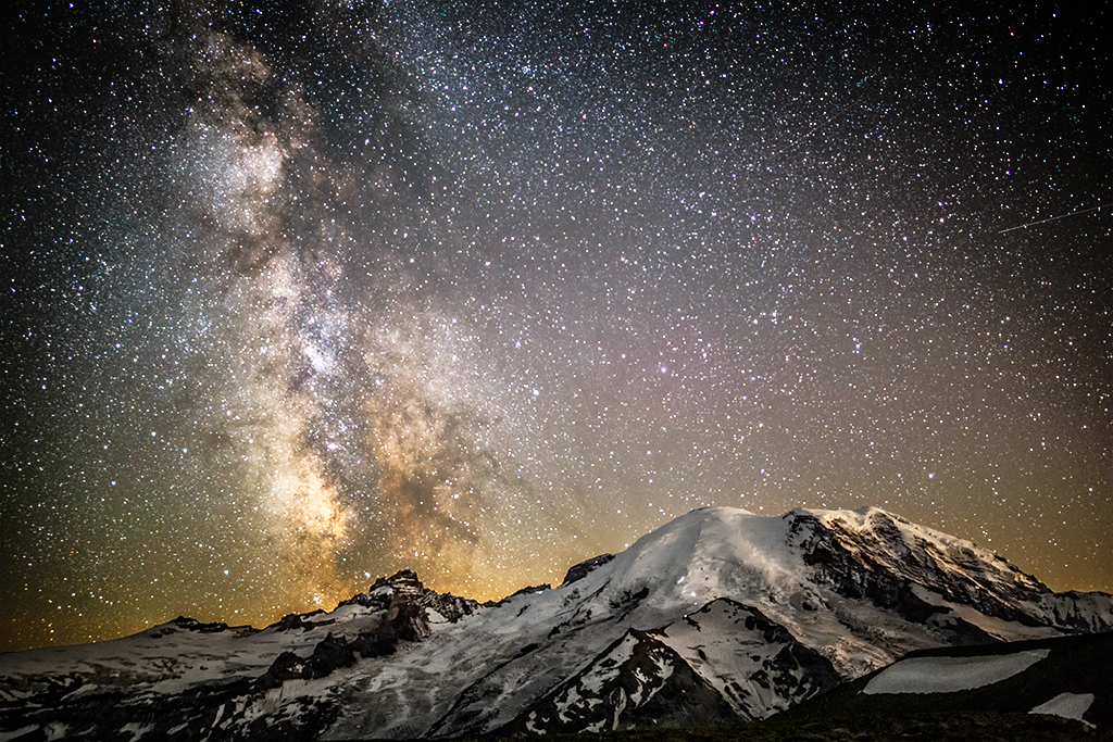
The photo we're going to work with is probably similar to some of the Milky Way photos you have taken. Here's a before and after so you can see what we're working with:

Before

After
Ready to follow along? Let's get started!
What to expect/my philosophy
The process I'm going to present is only one way to process this photo. If you're new to processing night sky photos, this will hopefully be a good place to start building your own workflow. If you've been doing this a while, you might completely disagree with how I do this, or you might not and might take a tip or two away. Most likely you'll be somewhere in-between.
The point I'm trying to make is that everyone will process night sky differently according to his or her own artistic vision. There's no right or wrong way. You should feel free to modify some or all of these steps to suit your own preferences and vision. In fact, I think you'll find that your results are better if you are invested in what you are doing, so please take this and make it your own!
What you'll need
You'll need a few things to follow along with this tutorial:
- A shot of the Milky Way.
- Lightroom, Bridge, or anything that uses Adobe Camera Raw. I use Lightroom. We'll need to do RAW processing on this file as a first step, so any of these will work.
- Photoshop. I use Photoshop CC, but anything newer than CS5 should work. You might be able to perform some of the steps with Photoshop Elements, but I can't be sure since I don't use it.
You might be wondering why I'm using both Lightroom and Photoshop. A lot of this is a workflow preference thing. I like using Lightroom to organize photos and do basic RAW processing, and Photoshop to do the heavy-lifting. You can certainly post-process night sky shots in one or the other, but I find Photoshop to be a lot more flexible for my needs, especially since night sky usually requires a lot of post-processing steps.
Other things that are helpful (and that I'll reference in this article), but not strictly required:
- Luminosity mask actions. I really like the ones Jimmy McIntyre offers.
- Noise reduction software. You can use the one provided by Lightroom/ACR, or you can use 3rd party software.
One other note - I use a Mac for my photo work. I'll try to be as platform-agnostic as I can, but there's nothing platform-specific here.
Step 1: Examining the photo
The very first thing we're going to do is load up this photo into Lightroom and take a look to see what we have. I think it's important to assess every photo before processing it so I can get an idea of what needs work. No two photos are alike, after all, and I always find it best to try to do the least amount of work I can to a photo.
Take a look at the image I provided and decide what you think looks good and what needs work. Then, compare to my list:
- The image is well-exposed. The histogram shows a good mix of midtones and nothing over or under exposed. Most Milky Way photos are way too dark, but you should always try to expose normally or even to the right (this is the subject of another article!)
- This image was shot at ISO6400. That means there's likely going to be a bit of noise to take care of.
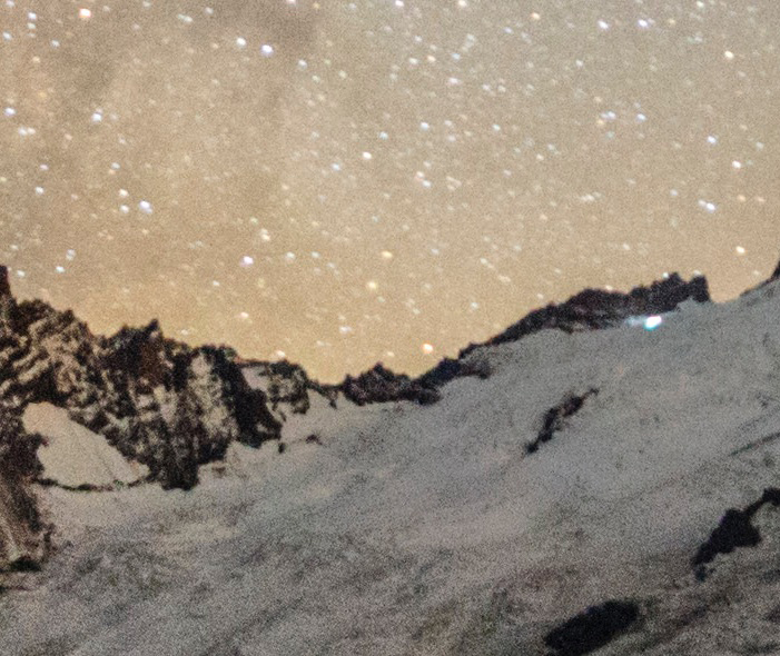
- The image is reasonably sharp for this lens (Rokinon 24/1.4 at f/1.4), but the stars have some chromatic aberration on them. You can see this as the purple fringing at a 100% crop of one of the corners below. You can see this image is also a little soft wide open, especially untracked, but we should be able to make it work.
- The ground is also a little soft, again due to the lens being used wide open.
- The white balance is actually not bad. A lot of Milky Way photos (especially with a lot of snow/bright scenes) suffer from poorly-selected automatic white balance. Still, we'll make adjustments here.
- The sky lacks contrast and color, which we'll of course fix.
- Conversely, I think the ground has too much color, and actually a little bit of color noise. I want to emphasize the sky here, so we'll fix this.
- The sky has a tinge of airglow and light pollution that are mixing to create a weird green/orange combination, especially at the lower left. Normally I think airglow looks cool, but here I think it looks weird and distracts from the Milky Way, so we'll take it back a bit.
- I really like the light falling on the mountain's right side. This is actually light pollution from the Seattle/Tacoma/Everett metro area. I think it gives the mountain a lot of definition, but the color is a little weird.
Again, depending on your vision, you might see some things I missed, or you might disagree with some of these. But that's part of the fun. :)

Histogram of the source image

Chromatic aberrations in the corner
Step 2: White balance
After getting the image into Lightroom, the first thing I always do is fix the white balance. White balancing and color grading night sky images is a complex topic that I cover in my book, but here I'll give you the basics of what you need to know.
First though, some theory. When I white balance a night sky shot, I always aim to get the sky color as neutral as possible. Even if I'm going to go for a warmer or cooler tone in the final product, I always aim to start with gray. The biggest reason for this is that by having a neutral white balance, I can bring the colors out more easily in Photoshop later.
Here's my favorite (and easy) way to get to a neutral white balance:
- Open the file in Lightroom's Develop module.
- Crank the Vibrance and Saturation sliders up to 100.
- This will make the image look hideous, but it's only temporary.
- You'll notice that the image is a collection of blue and yellow splotches. Your goal is to move the white balance slider until you have a roughly even amount of blue and yellow. You can also use the brush and gradient tools to smooth out hotspots.
- When you think you have roughly as much blue as you have yellow, reset Vibrance and Saturation back to 0.
- Voila - you have a neutrally balanced image!
This image as originally shot was at 4150K with a +4 tint. It's actually pretty close to neutral, and I wound up using a 4200K +5 white balance for it.
Step 3: Lightroom adjustments
I typically don't do too many adjustments in Lightroom for night sky shots, as I prefer to do most of the work in Photoshop since I have more control. For this image, I made the following adjustments:
- I left exposure and contrast at 0. The image is well-exposed, and I'll adjust contrast later in Photoshop.
- Shadows to +52. Although the histogram was well-exposed, I felt that some of the shadows were a little dark and took this opportunity to recover them.
- I left the white and black points at 0.
- Clarity to +76. I don't normally take clarity this high, but for stars a bit of extra clarity can help define the smaller ones. Clarity is essentially local contrast. Some images can also benefit from brushing in a bit of extra clarity in the sky, but be careful about pushing clarity too high as it can increase visible noise as well as haloing artifacts.
- Vibrance to 0. I don't use Vibrance very often in Lightroom, as I prefer to mask it to specific areas in Photoshop if needed.
- Saturation to +35. I don't normally increase saturation in Lightroom, but did so here so that the image would be converted from RAW with a little bit more color to work with.
- Remove chromatic aberration. I usually use the eyedropper tool, find a star with a lot of CA, and click on the purple fringing.
I didn't use any local brushes or gradients for this shot. If you're using Adobe Camera Raw or Bridge, you have the same tools at your disposal and can make these same adjustments.
Perhaps most important are these settings:
- Sharpening to 0. We'll sharpen in Photoshop at the very end.
- Luminance/contrast noise reduction to 0. We'll noise reduce more precisely in Photoshop.
- I usually leave color noise reduction in Lightroom at the default. There are times I will adjust this, but that's the subject of another post.
- I didn't use a lens profile, as a good one for the Rokinon 24/1.4 didn't exist when I took and processed this shot. With night sky shots, however, I often find that a lens profile can be detrimental to some images as "fixing" the vignetting in the corners can increase noise in those areas. Experiment and see what you like.
And with that we're ready to bring the image into Photoshop. One trick once you've brought the image into Photoshop - be sure to unlock the background layer by clicking the little lock icon next to it.
Step 4: Masking
Step 4 is probably the most important step in the entire process. We need to produce masks that allow us to modify individual areas of the photo separately. In this shot, the main thing I want is to be able to treat the foreground separately from the background. I also want to adjust bright and dark areas separately, so I will also use luminosity masks to achieve this.
Masks are a deep topic with a lot of nuances. In particular, this photo represents probably the simplest scenario you can have - a clean horizon line where you can just draw a mask in, which is exactly what we're going to do. It starts getting much more complex when you have trees, people, or other things in the shot.
Let's start by making a mask for the sky. First grab the quick select tool:

Quick select tool
If you haven't used this tool before, you just draw in the area you want to select, and Photoshop tries to be smart about finding edges. You can add and subtract from the selection using the toolbar buttons, or your option/control/command keys:

Quick select tool options
For night sky, I usually find it easiest to draw around the sky as opposed to the ground, since the sky is pretty uniform. Basically, just click somewhere in the sky near the ground (I started at lower left), and drag over to the lower right, then upper right, and finally upper left. You'll see the marching ants appear. You can refine the selection easily with the addition and subtraction tools. Here's what my selection looks like:

My selection
Now that you have your selection, we need to save it so we can use it later. Go to the Select menu and choose Save Selection. Give it a name like "Sky". If you go to the Channels palette, you'll see your selection there:

Channels palette
We're going to come back to the Channels palette a bunch during this tutorial, so get familiar with where it is. If you aren't familiar with it, all it does is displays masks from different sources. By default you get an RGB mask (e.g. select everything), and masks for red, green, and blue. As you save new masks, like your Sky mask, it will appear here.
Now that we have a sky mask, let's make a ground mask. Hold down Command (or the Control key on a PC) and click the Sky mask. You'll see the marching ants reappear. Now go to the Select menu and choose Inverse. Then, save this selection again, but call it "Ground".
The last thing we're going to do with masks for now is run our luminosity mask action. If you don't have an action to create luminosity masks, I've provided a link above where you can download an action for them. Run the action and you'll get a bunch of new channels on the channels palette, like "Brights 1", "Brights 2", "Darks 1", etc.

Luminosity masks
Don't worry about these too much for now - we'll come back to them soon.
Step 5: Noise reduction
If you've been shooting night sky for any length of time, you've undoubtedly noticed noise (or grain) in your images. Depending on your camera, you might start seeing noise at ISOs as low as 800 or 1600. This image was taken with a Canon 6d, which is a reasonably good high ISO performer. I routinely shoot at ISO 6400 (as I did for this image), and sometimes higher.
Noise close up
The higher you shoot, the more noise is introduced into your image. Noise reduction software is useful for reducing noise, but at some of the higher ISOs other techniques are needed. For this image, we'll just be reducing noise with software.
If you take a close look at the image, you'll notice two things about the noise:
- The noise is way more noticeable on the ground compared to the sky. This is because there is a lot of detail in the ground, and the noise looks much more out of place. In particular, look at the crevasses on the glacier, and you'll see a lot of texture, but also a lot of noise.
- The noise is the sky really isn't that bad. It actually looks a little like stars. In fact, it looks so much like stars that most noise reduction software will confuse noise and stars.
Based on these two observations, we're going to reduce noise twice and combine the results. We'll apply a light noise reduction process to the sky, so as not to take away some of the fainter stars. For the ground, we'll apply a heavier noise reduction technique, but we'll recover some of the edge details later.
Fortunately this technique is easy, since we already made the masks we need! Let's start with the sky. I used Nik Dfine for this image. Dfine usually does a pretty good job picking out spots to measure, but it has trouble with the sky. So, I usually follow these steps:
- Switch the measure mode to Manual.
- Find and delete all of the measure boxes. In this image, most of them are on the ground, which has no bearing on the sky.
- Zoom in and find a patch of sky that doesn't have any stars. I usually like to find something towards the middle to avoid the vignette or soft corners.
- Click on the box tool and drag the box in your small patch of sky. This box can be really small.
- Now click Measure Noise.
You can see the very small box I drew below.

Nik Dfine close up
Before we finish with Nik, flip over to the Reduce tab and reduce the contrast noise to around 30-50%. You can drag the red compare slider back and forth to see the effect, but generally I go for reducing only the very fine grain details in the sky.
If you don't like the results, you can go back and add more measure boxes (don't forget to click Measure Noise), or further reduce the contrast noise slider. I usually leave the color noise slider at 100% as I find that Nik does a good job overall with this type of noise.
Once you're satisfied, click OK. A new layer will be created in Photoshop. Rename it to "NR Sky".
Now comes the important part - we're going to apply this noise reduction only to the sky. To do this:
- Switch over to the Channels palette.
- Find your Sky mask.
- Hold down Command (or Control on a PC) and click on the thumbnail of the sky mask. This will select the mask (you should see marching ants).
- Switch back to the Layers palette.
- Click on your NR Sky layer.
- Click the new layer mask box at the bottom of the Layers palette.
Here's the button if you don't know where to look:

New layer mask button
Once this is done, you should see a mask created for your layer with the selection you picked from the Channels palette. It will look like this:

Noise reduction layer
Now, we can do the same thing for the ground:
- Click the eye next to your "NR Sky" layer to hide it. We want Nik to only look at your base layer.
- Open up Dfine again.
- Usually Dfine will pick the right set of measure boxes for the ground. If not, adjust to taste.
- I usually leave both contrast and color noise reduction at 100%, but you can adjust to taste. I usually err on the side of less noise reduction, as too much looks fake.
- Click OK to create a new layer. Rename it to "NR Ground".
- Go to the Channels palette and find your Ground mask.
- Command (or Control on a PC) click on the thumbnail of the ground mask.
- Switch back to the Layers palette, select your NR Ground layer, and click the new layer mask button.
- Unhide the NR Sky mask (click the eye).
You should now have your image noise reduced separately for both ground and sky.

Noise reduction layers
And that's it! I usually group all of these layers into a group called "Noise Reduction" by selecting all the layers and pressing Command + G.
Step 6: Foreground
The previous steps have all been about preparation - we haven't made that many interesting changes to our image. That's about to change! We'll start with the foreground, and in the next step take care of the sky.
Recall from earlier that we identified a few things to fix with the foreground:
- The ground was a little soft in terms of sharpness.
- The ground had a lot of noise that caused some of the texture to get muddy.
- There was an odd color cast on the ground, and some color noise.
Let's start by fixing the first two items. When I first worked on this image, I figured that the ground just needed an extra bit of sharpening. I found, however, that the sharpening by itself didn't really take care of restoring some of the detail in the ground. In particular, there are a lot of interesting edges and textures that I wanted to accentuate. To get the edges and textures where I wanted them required a lot of sharpening, which also introduced a lot of noise.
After some experimentation, I decided to use a detail extractor plugin. There are a bunch of different ones available, but I used the one in Nik Color Efex. This plugin has the effect of boosting local contrast a lot (kind of like clarity), and it's easy to overdo it. I wound up with these steps:
- Merge all visible layers (Command + Option + Shift + E). Nik's plugins will generally operate on the topmost layer, which in my case was a masked noise reduction layer for the sky. We want the whole image.
- Run Nik Color Efex and choose the detail extractor.
- Boost the detail extractor and contrast sliders until the ground has a bunch of definition. The sky will look terrible, but as long as the ground looks okay, you're fine.
- Click OK.
- You'll see a new layer with your results. Select it.
- Choose the Channels palette, and Command + click on the "Ground" layer to select it.
- Switch back to the Layers palette and click the New Layer Mask button.
- Adjust the opacity to taste. I wound up taking the opacity way down to around 40% as I liked the result better.
Here's the before and after. You can see there's quite an improvement in the ground's texture and definition. In particular, look at the definition of the shadows on the mountain above where the climbers are.

Before
After
To fix the color cast on the ground, we have a bunch of options available. For this shot, I wound up using one of the simplest: just reduce the saturation. This de-emphasizes the color cast, and also helps de-emphasize the color noise. Here's what I did:
- Switch to the Channels palette.
- Command + Click on the "Ground" layer.
- Switch back to the Layers palette.
- In the "Add an adjustment" panel (under the "Adjustments" tab), I added a new Hue/Saturation layer.
- The layer is created with our selection as the mask (score!).
- Double click on the adjustment area (the little yin/yang half moon symbol).
- I wound up dropping the saturation by only about 15 or 20. Experiment to see what you like.
Again, here's the before and after. The difference is subtle, but I prefer the ground to be desaturated. For comparison purposes, look at the way the light hits the side of the mountain on the right.

Before

After
Depending on the image, there are a ton of other ways to make this adjustment. We'll actually cover a different approach for the sky shortly which you can use for the ground too.
Those are all the adjustments I made to the ground. If you like, select both layers and Command + G (or Control + G) to group them into a new layer, and name it "Ground" for ease of organization.
Step 7: Sky
Now, it's time to make the image really sing! This photo is all about the Milky Way, and we're going to make it pop! Here's our punch list from earlier dealing with the sky:
- Contrast
- Color and saturation
- Sharpness
We'll take care of sharpness at the very end. Let's start with contrast. This, along with color, is the key adjustment that makes the image pop. I'll show you two ways to do this, but you'll have to decide which approach you like best.

Contrast curve
First, the most obvious - and easiest - thing to do is apply a sharpness curve to the entire sky. By now you might be able to guess how we're going to do this, but just in case, here's the steps:
- Switch to the Channels palette.
- Find the "Sky" mask.
- Command + click it to select it.
- Switch back to the Layers palette.
- In the adjustment layer panel, click on the button for a new contrast layer (it looks like a little contrast curve).
Note that from now on, I'm just going to say "add a contrast adjustment layer with the sky mask" instead of repeating these steps.
Once you have the contrast adjustment layer added, you can adjust to taste. Just click the half circle (yin/yang) symbol to open the adjustment layer panel. You can make the curve as steep or as shallow as you like. Here's the curve I used for this image:
Personally I feel like this image can take a pretty strong contrast curve, but you'll need to tweak this on a per-image basis. I don't find templates or presets helpful here, as each image is unique. Here's the before and after:

Before

After
One of the reasons this image can take a very strong curve is that the masks are really clean - there's clear separation of the foreground from the background. If this is not the case with your image (e.g. you have trees or something in the way), you may not be able to use as strong of a curve, or may need to refine your mask. Always inspect the boundary between the sky and ground. If you see weird artifacts, you'll either need to tone down the curve, adjust your mask, or both.
If you have such an image, or don't prefer as strong of a contrast, there's another method you can use, involving luminosity masks. This technique is particularly good when you have trees and other things that make a hand-drawn selection difficult. Instead of choosing the sky mask, try these steps:

Luminosity mask
- Switch to the Channels palette.
- Find one of the "Brights" luminosity masks that we created earlier, and Command + click to select it. I picked "Brights 1".
- Find the "Ground" mask.
- Hold down Option + Command and click on the ground mask. Holding option tells Photoshop to subtract the ground mask from the selection.
- Switch back to the Layers palette and add your curves layer.
The result should be a mask that looks like the mask at left.
Now you can apply the curve used earlier. Because the mask is only selecting the brights, you can apply a much steeper curve. As well, this approach can work when you don't have as clean of a mask between the ground and the sky. You can compare both approaches below:

Sky mask

Luminosity mask
Personally for this photo I prefer the sky mask approach, but try both and see what you like. Additionally, don't be afraid to try other luminosity masks, as sometimes Brights 2 or 3 is more appropriate. It really depends on the image and the look you are trying to achieve.
By now, you might have noticed that our image is suffering from a weird color vibe. It has that "I just discovered the contrast slider in Lightroom" look, and the yellow and green cast is overbearing, at least to my eye. Some purists will argue that the natural color of the night sky is a yellowish orange, and they are correct, but that doesn't mean we can't also show some of the other colors, and even take a little artistic license to adjust the image how we like.
The first adjustment I'll show you is the easiest. I'm going to use a photo filter layer to inject a broad color cast on the sky, in this case a touch of blue, as I think the sky is a bit too warm overall. However, I'm only going to apply this to the stars, as I don't want the blackness of the sky to get a blue tint. Here's how to do it:
- Follow the steps I outlined just above to make a selection of "Brights 1 minus Ground".
- Add a Photo Filter layer.
- Choose a blue filter. I chose the LBB cooling filter and kicked up the density to about 40%.
Here's the before and after:
Before
After
Already we have some nice color back into the sky. The brightest parts of the Milky Way are almost white, and there's a tinge of pink that emphasizes the nebulosity of this area of the sky.
Next, I'm going to add a color balance layer as I want to further adjust some of the colors. Again, I'm going to use the "Brights 1 minus Ground" mask to only apply this to the bright parts of the sky. As a shortcut to following the steps to recreate the mask, I can just reuse the mask from my photo filter layer by Command + clicking on it.
You can play around with this tool to great artistic effect. Even small changes will yield wildly different results. For instance, here's a combination that adds a lot of pink and red to the sky:

Adjustments

Results
Or, if you prefer, here's a combination that emphasizes the cooler tones in the sky:

Adjustments

Results
The cool thing about this is that you can make the look you want really easily, without also making the rest of the sky or ground look funny. Play around and see what you can create! In my picture, I went for more emphasis on the pinkish/reddish hues because I liked the look.
By the way, there are a ton of other ways to do color control, and this is one of my favorite ways to adjust images. I cover this topic and various techniques to do it extensively in the book.
The last adjustment I made was to add a saturation layer, again using the same mask we used for the color balance and photo filter. I felt like a small saturation kick (+10 to +20) helped deepen some of the colors in the Milky Way.
One thing you might find after doing these adjustments is that an effect is too pronounced, or not enough. The great thing is you can go back and adjust them separately to get the look you're after.
As we did with the sky, I usually like to group the sky adjustment layers into a group named "Sky".
Step 8: Final steps
We can now save and export our finished image and bring it back into Lightroom. Simply save and close Photoshop and you'll have your finished image right next to the original in your Lightroom catalog.
The final step is to sharpen the image. I always do this in Lightroom because I apply different levels of sharpening for different output types (web, print, etc). Go easy on the sharpening here as you can quickly introduce more noise, and use the "Mask" slider to scope the sharpening effect to just the key parts of the image.
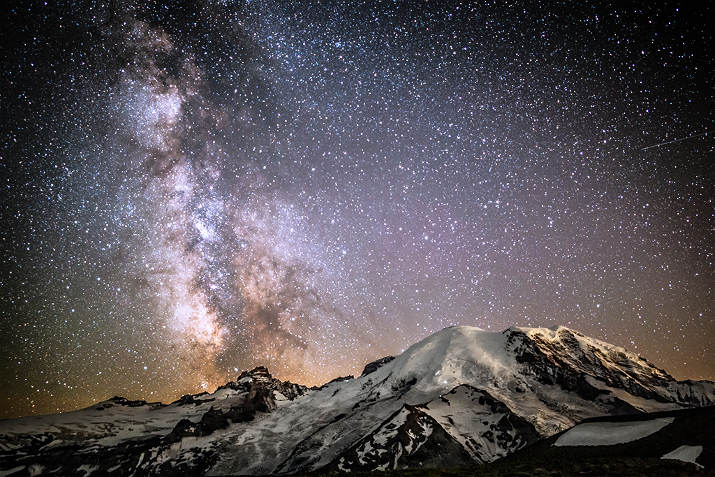
Here's the final result:

Final result
What next?
Hopefully this article was helpful! If you'd like to learn more:
Check out my new book The Complete Guide to Milky Way Photography.
Check out some of the other articles I’ve written.
Subscribe to my mailing list to get notified when I share new articles.